Dashboard Page
In this guide, you will learn how to effectively navigate through the Dashboard page on the APItoolkit dashboard and maximize all the powerful features accessible in it.
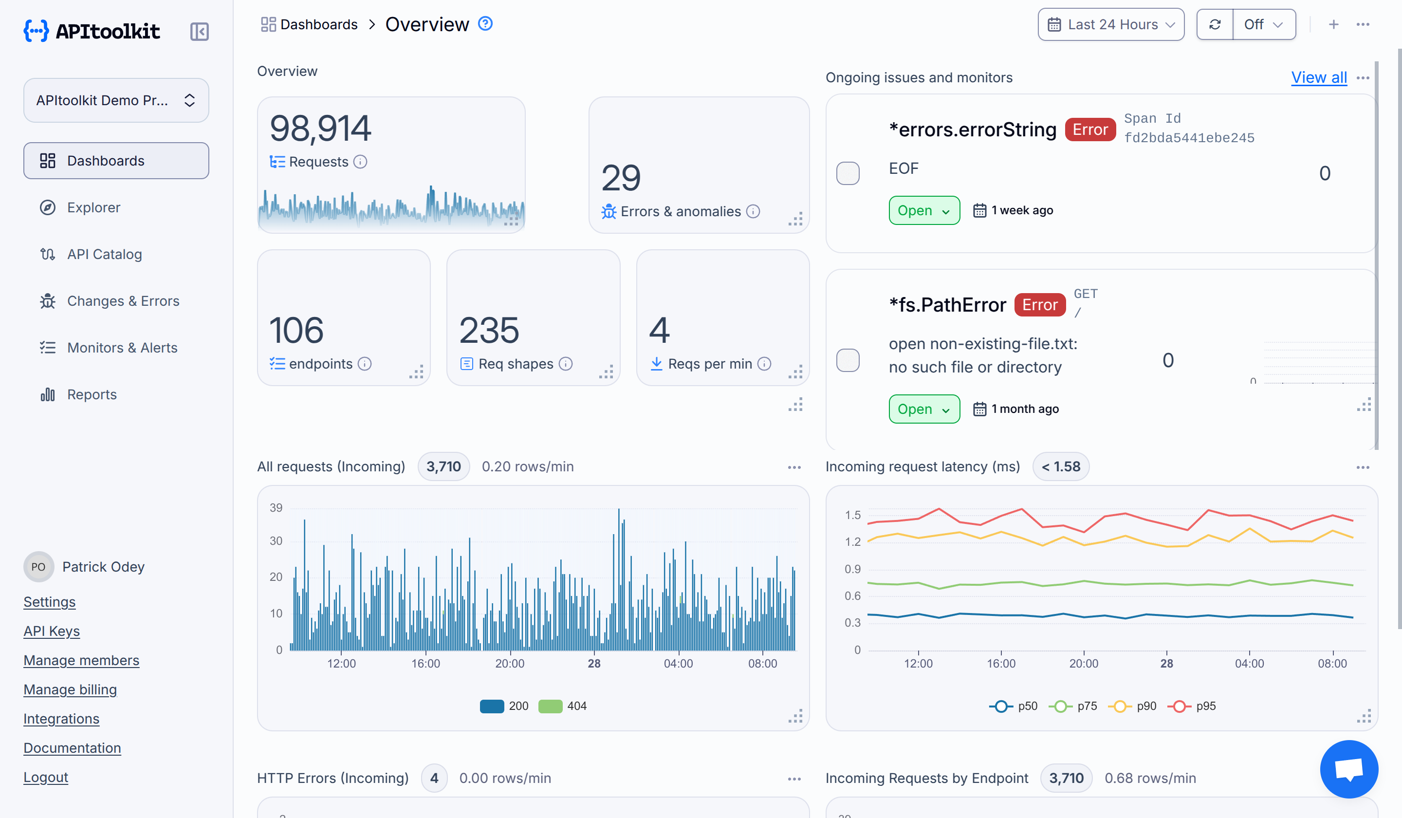
On this page, you will find a summary of all the API analytics, including requests, anomalies, endpoints, etc. alongside all the requests visualized by status code, errors, endpoint, and latency percentiles. You can filter the data using the toggle at the top-left section of the page from the Last Hour, Last 24 Hours, Last 7 Days, Last 14 Days, or input a custom date range (the default is Last 7 Days).

This page is split into two parts, Ongoing Anomalies and Monitors and Analytics.
Ongoing Anomalies and Monitors
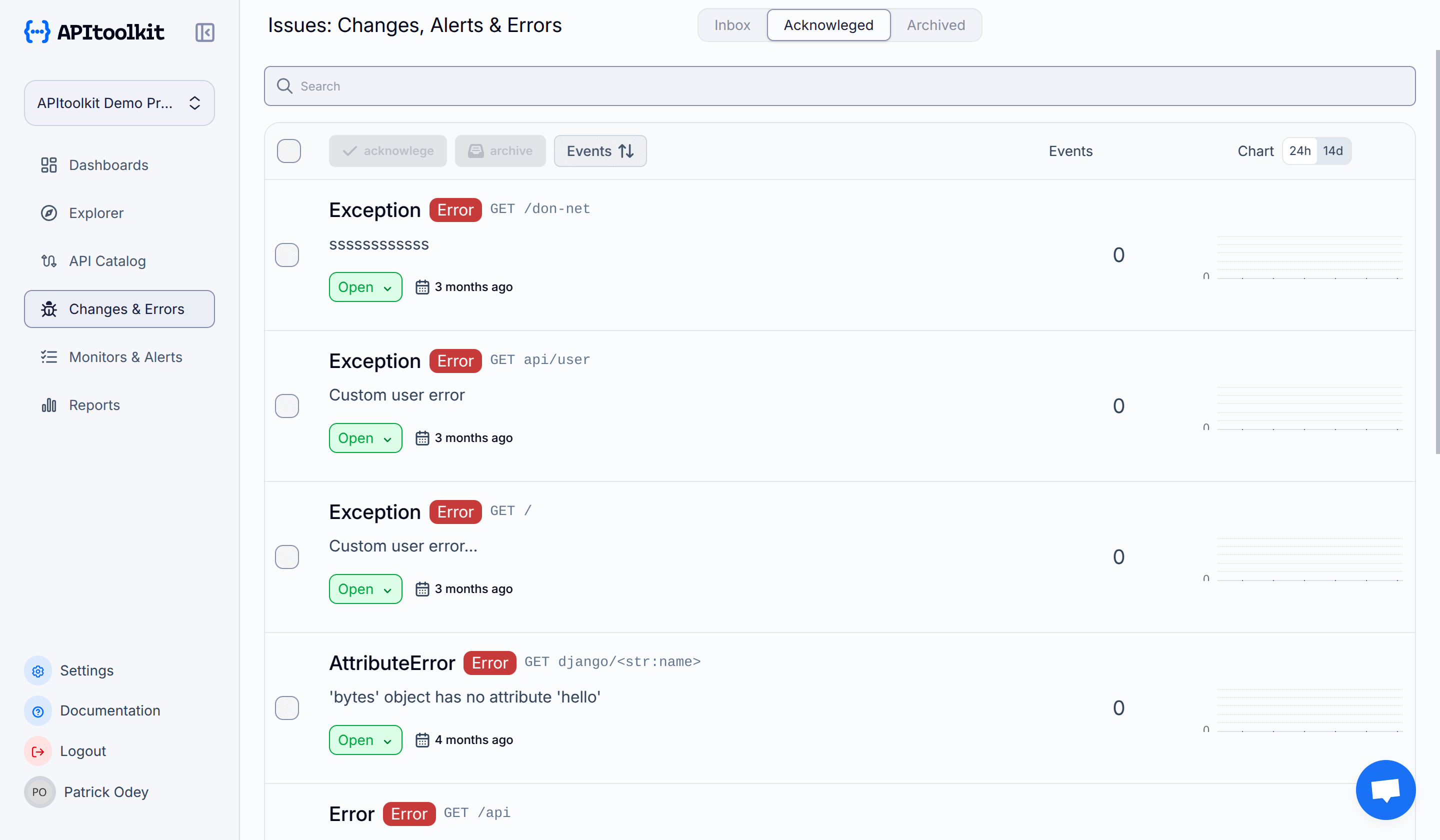
This section displays a quick summary of all ongoing anomalies detected from different request types on your API, including the endpoints they were detected on, and the new, updated, or deleted fields detected. You can view all the anomalies alongside errors in more detail on the Changes & Error page.

An anomaly is any user activity (requests) on your API that is significantly different from previously tracked activities. This might surface as increased response times, error rates, or downtimes, and can be caused by a variety of conditions such as API changes, server issues, network issues, or security threats.
API Analytics
This section displays some data analysis and visualization from all the requests tracked from your API. Have you ever seen a website tracking analytics dashboard like Google Analytics or Fathom? This is similar but instead of getting analytics for your website, you get for your API! This section includes the following parameters described below.
Data Counts
- Requests: Total number of requests in the past two weeks.
- Anomalies: Total number of anomalies still active this week vs the last week.
- Endpoints: Total number of endpoints now vs the last week.
- Request Shapes: Total number of request signatures that are active now vs the last week.
- Requests per minute: Total number of requests per minute this week vs the last week.

Graphs
- Requests by Status Code: HTTP status code distribution for all requests.
- Latency Percentiles: Response time distribution at the 50th, 75th, and 90th percentiles.
- Errors: Requests with error status responses grouped by status code.
- Requests by Endpoint: All requests grouped by endpoint.
- Request Latency Distribution: Summary of the response time distribution.
You can hover on all the graphs or click on the options below them to access more filtering options and data previews.

Latency is the amount of time it takes for a packet of data to travel from one place (source) to another (destination).
A percentile is a statistical term that indicates the value below which a specific percentage of data points fall in comparison to the remainder of the data. For example, a value at the 75th percentile indicates that 75% of the data points are below that value and 25% are above it. Percentiles are commonly used to analyze the distribution of a dataset and to identify outliers or anomalies. Common percentiles include: 25th percentile (Q1), 50th percentile (median or Q2), 75th percentile (Q3), 90th percentile, 95th percentile, and 99th percentile.
Here’s a quick video overview for a visual walkthrough of this page:
Next: Endpoints Page